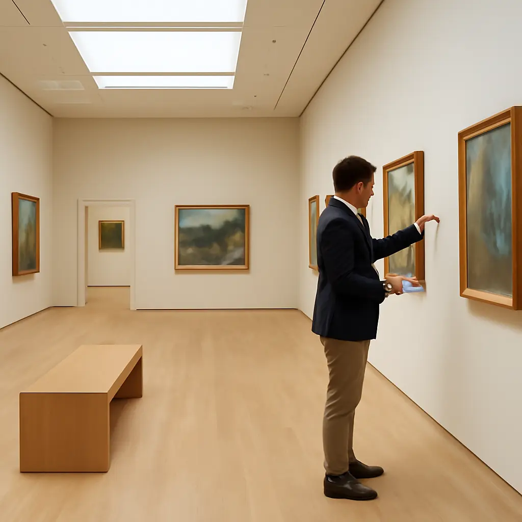
A gallery that flows naturally guides visitors from one artwork, object, or display to the next without confusion or fatigue. The key is to plan a clear route, group works thoughtfully, preserve comfortable viewing space, and use lighting and labels consistently. The Smithsonian’s accessibility guidance and museum-planning practices emphasize clear circulation and usable viewing conditions, while visitor research consistently shows why these details matter: people need to be able to navigate, pause, and understand what they are seeing. Whether arranging a home art wall or a public exhibition, start with the visitor’s experience, then shape the layout around the collection.
Gallery Flow and Visitor Circulation
Gallery flow is the planned movement of visitors through a display space. Museum-planning guidance treats circulation as more than a path between objects: it includes orientation, access, places to pause, and the choices visitors can make along the way. A successful layout makes the intended route easy to understand without making exploration feel compulsory.
Create a clear route without forcing it
A route can be linear, looped, or open-ended. A linear sequence suits a chronological story, while a loop can bring visitors back to an entrance or central point. An open layout gives visitors more choice but needs strong visual cues so they can see where to go next. At the National Gallery of Art, visitors encounter distinct galleries and collection groupings within a larger navigable museum; the lesson for smaller spaces is to make transitions and destinations legible.
Sketch the room before hanging anything. Mark doors, windows, fixed furniture, and likely bottlenecks, then draw a route that avoids dead ends and leaves room for people to stop. In a small home gallery, this might mean keeping the main wall visible from the entrance and placing secondary works along the natural path through the room.
Protect accessible circulation and viewing space
An accessible gallery lets visitors move through the space and approach displays without avoidable barriers. The U.S. Access Board’s ADA Standards specify a minimum clear width of 36 inches for an accessible route in many situations, with wider passing spaces needed where routes are narrower. Treat this as a baseline to check against applicable requirements, not as a complete design specification: doors, turns, ramps, and local codes can impose additional conditions.
Keep seating, signs, and interactive elements from narrowing the route. Leave enough room for visitors to step back from artworks and for others to pass. If the gallery serves a broad public, assess the path from the entrance through every viewing area rather than checking only the main aisle.
Gallery Grouping and Visual Rhythm
Grouping is the arrangement of works according to meaningful relationships, such as subject, period, material, artist, or visual character. The American Alliance of Museums’ exhibition-planning resources emphasize that interpretation and object selection work together: the arrangement should help visitors recognize connections, rather than leave them to guess why objects share a wall.
Build groups around a clear idea
Choose one organizing idea for each zone and make it apparent through the objects, labels, or introductory text. A group might compare portraits across generations, show different techniques in one medium, or trace how a local landscape has changed. Avoid mixing several unrelated organizing principles in a single cluster unless the contrast itself is part of the story.
For example, a community gallery could place historic photographs beside contemporary images of the same street. The shared location creates an immediate connection, while short labels explain changes in use, architecture, or neighborhood life. This approach gives visitors a reason to compare rather than simply move past each image.
Use spacing and visual rhythm to guide attention
Visual rhythm is the pattern created by repetition, variation, scale, and spacing. Repeating frame sizes or consistent gaps can make a display feel calm; a deliberate shift in scale or color can signal a new section or focal work. The goal is not identical spacing everywhere, but a visible pattern that supports the exhibition’s meaning.
Hang a focal work where it can be seen from the entrance or a natural approach, then let smaller works lead toward it. For a group of related pictures, align either their centers or their top edges and keep gaps consistent. In a mixed-object display, vary height and shape while preserving enough negative space for each object to register clearly.
Gallery Lighting, Labels, and Interpretation
Lighting and interpretation shape how visitors see and understand a collection. The International Council of Museums’ conservation guidance stresses that light can cause cumulative damage to sensitive materials, so exhibition lighting must balance visibility with preservation. Labels, meanwhile, should explain the significance of objects without interrupting the visual experience.
Light artworks for both visibility and preservation
Use lighting to make details visible while avoiding glare, harsh shadows, and unnecessary exposure. Works on paper, textiles, and other light-sensitive materials generally require more cautious exposure than many objects made from less sensitive materials. The Canadian Conservation Institute’s preventive-conservation guidance explains that light damage accumulates over time and cannot be reversed, so both light intensity and display duration matter.
Test lighting from the visitor’s likely viewing positions. Check whether glass reflects windows or spotlights, and avoid placing a bright fixture where it draws attention away from the work. For valuable or fragile collections, consult a conservator or follow the institution’s collection-specific light limits rather than relying on a one-size-fits-all setting.
Write labels that support the visitor’s journey
A gallery label identifies an object and gives visitors useful context, such as its maker, date, material, or relationship to the exhibition theme. Place labels consistently near the works they describe, use readable type, and keep the essential information concise. Longer interpretation can sit at the entrance or in a separate text panel so visitors can choose how deeply to engage.
Think of labels as part of the route. An introductory panel can orient visitors at the threshold; section headings can mark changes in theme; object labels can add detail at the point of viewing. If labels are too dense or placed inconsistently, visitors may stop in the path or struggle to connect text with objects.
Gallery Testing and Practical Setup
A layout that looks balanced on paper may feel crowded or unclear in person. Exhibition planning therefore benefits from testing: review the route, view works from different heights, and observe whether visitors can navigate and interpret the display comfortably.
Mock up the layout before installation
Use paper templates, removable tape, or digital room plans to test positions before drilling or moving heavy objects. Walk the route from the entrance, pause at likely viewing points, and check sightlines between sections. A simple floor plan can also serve as a textual equivalent of a flow diagram: mark the entrance, route, focal works, seating, labels, and turning points.
Review the gallery with visitors in mind
Ask a few people unfamiliar with the collection to walk through the space. Notice where they hesitate, overlook an object, block one another, or ask for directions. Their responses can reveal problems that the organizer may miss because the intended story is already familiar to them.
- Can visitors identify where the gallery begins and what the central idea is?
- Can people pass one another and approach the works without crowding?
- Are labels easy to associate with the correct objects?
- Does lighting support viewing without glare or avoidable exposure?
- Can visitors pause, sit, or choose a shorter route where appropriate?
Conclusion: Make the Gallery Easy to Navigate and Worth Exploring
A gallery flows naturally when circulation is clear, groups have a meaningful organizing idea, spacing creates visual rhythm, and lighting and labels help visitors engage with the work. Start by mapping the route and checking accessibility, then organize the collection into understandable sections and test the experience in the actual space. For further guidance, consult museum exhibition-planning and conservation resources, and invite visitors to give feedback before the display is finalized.
Sources: U.S. Access Board, Guide to the ADA Accessibility Standards, https://www.access-board.gov/ada/guides/chapter-4-accessible-routes/; American Alliance of Museums, Exhibition Planning, https://www.aam-us.org/programs/resource-library/exhibition-planning/; International Council of Museums, ICOM-CC: Light and Lighting in Museums, https://www.icom-cc.org/en/working-groups/preventive-conservation; Canadian Conservation Institute, Agent of Deterioration: Light, Ultraviolet and Infrared, https://www.canada.ca/en/conservation-institute/services/agents-deterioration/light.html; National Gallery of Art, Visit the National Gallery of Art, https://www.nga.gov/visit.html.